E.B. Campbell Flow Visualization
About
The Saskatchewan River Delta is a place of historical, cultural, and ecological significance where upstream management decisions on the North and South Saskatchewan rivers are compounded. This tool aims to bridge the gap between those who make such decisions and stakeholders who experience the effects. It does so by presenting a breakdown of inflow and outflow associated with Tobin Lake, and presenting photo and water level snapshots associated with specific time periods and outflows.
Tutorials
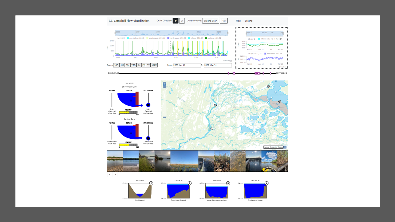
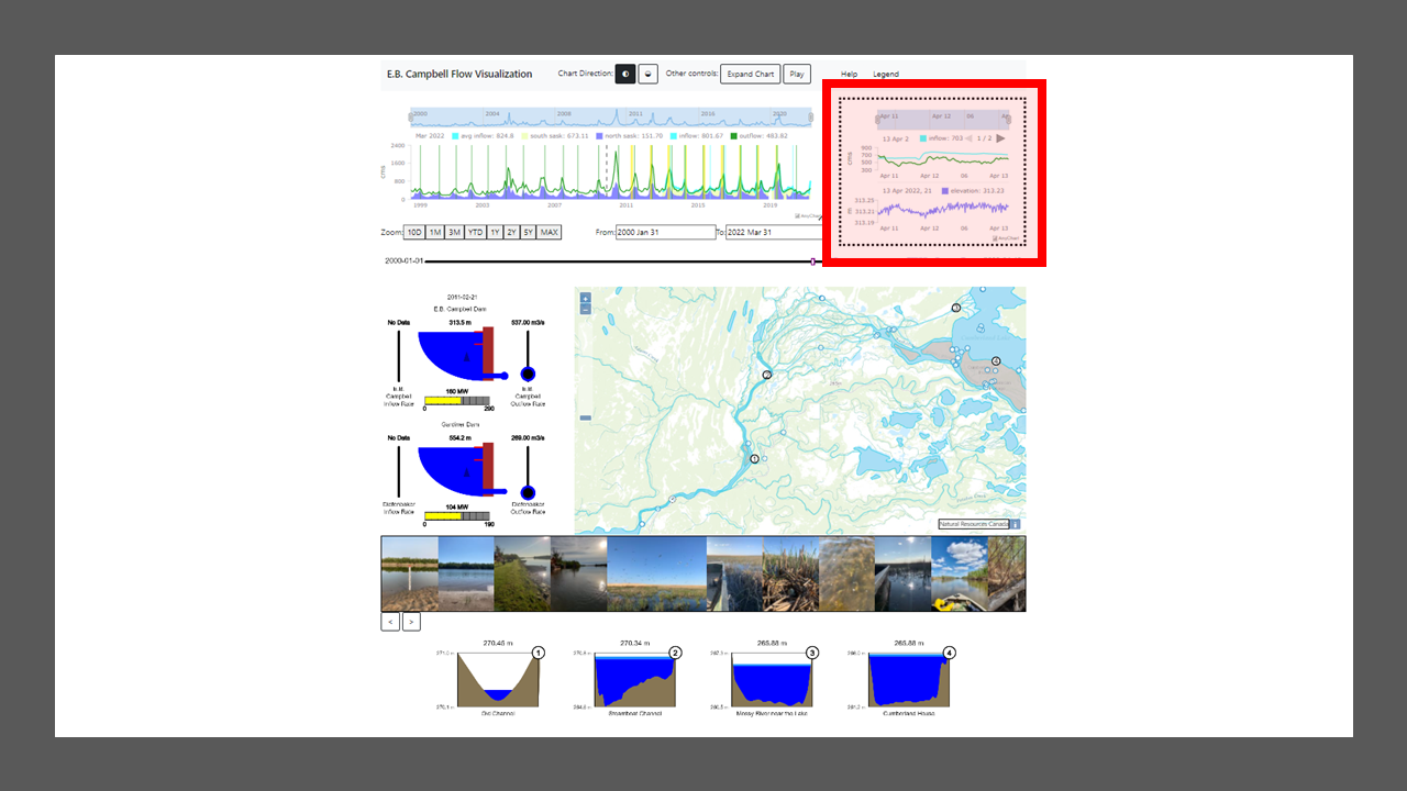
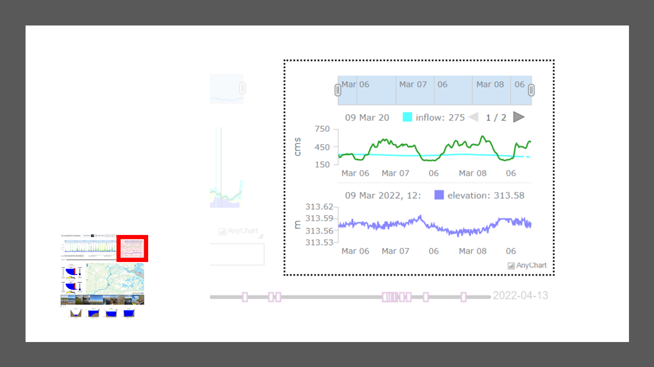
This section displays roughly the last 48 hours of inflow, outflow, and elevation data for Tobin Lake. This data is collected hourly from Environment Canada and will show the most recent information available. The top part of the chart shows inflow and outflow in cubic metres per second (cms):
- Blue line: inflow as measured below the Forks (SASKATCHEWAN RIVER BELOW THE FORKS, 05KD007)*
- Green line: outflow as measured below Tobin Lake (SASKATCHEWAN RIVER BELOW TOBIN LAKE, 05KD003)
The bottom part of the chart shows the elevation of Tobin Lake in metres. It is important to note that the fluctuations in elevation are generally only a few centimetres.
- Purple line: elevation as measured at Tobin Lake (TOBIN LAKE AT THE SPILLWAY, 05KD004)
* SUBJECT TO CHANGE
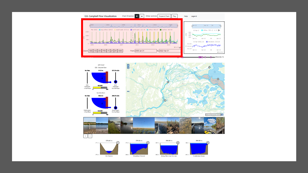
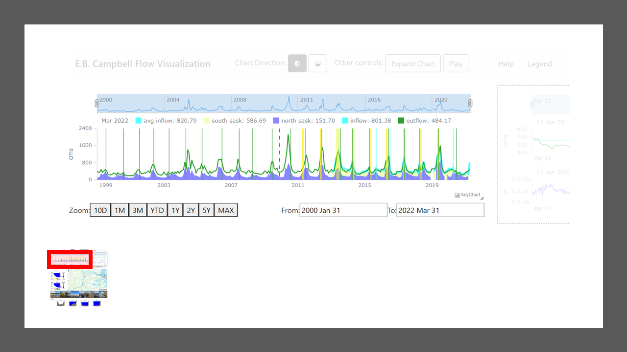
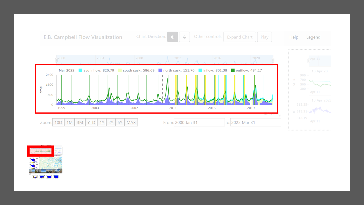
This section charts Environment Canada data from 2000 to the present. In the standard view, this chart displays inflow and outflow from Tobin Lake in cubic metres per second (cms):
- Blue line: inflow as measured below the Forks (SASKATCHEWAN RIVER BELOW THE FORKS, 05KD007)*
- Green line: outflow as measured below Tobin Lake (SASKATCHEWAN RIVER BELOW TOBIN LAKE, 05KD003)
The area below the inflow line is filled to demonstrate the contribution from the North and South Saskatchewan Rivers:
- Purple area: inflow as measured in Prince Albert (NORTH SASKATCHEWAN RIVER AT PRINCE ALBERT, 05GG001)
- Yellow-green area: the difference between inflow as measured below the Forks (05KD007) and inflow at Prince Albert
* SUBJECT TO CHANGE
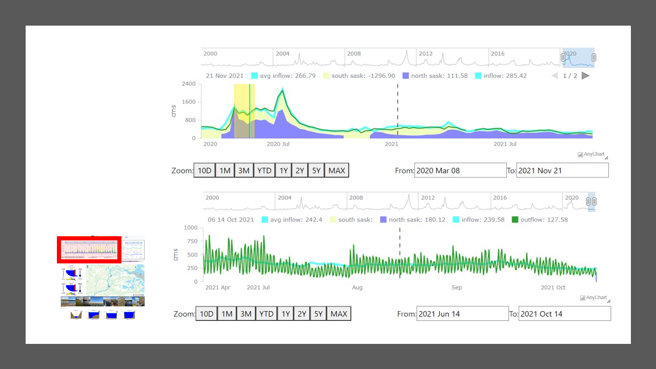
There are four options for navigation in the historical chart:
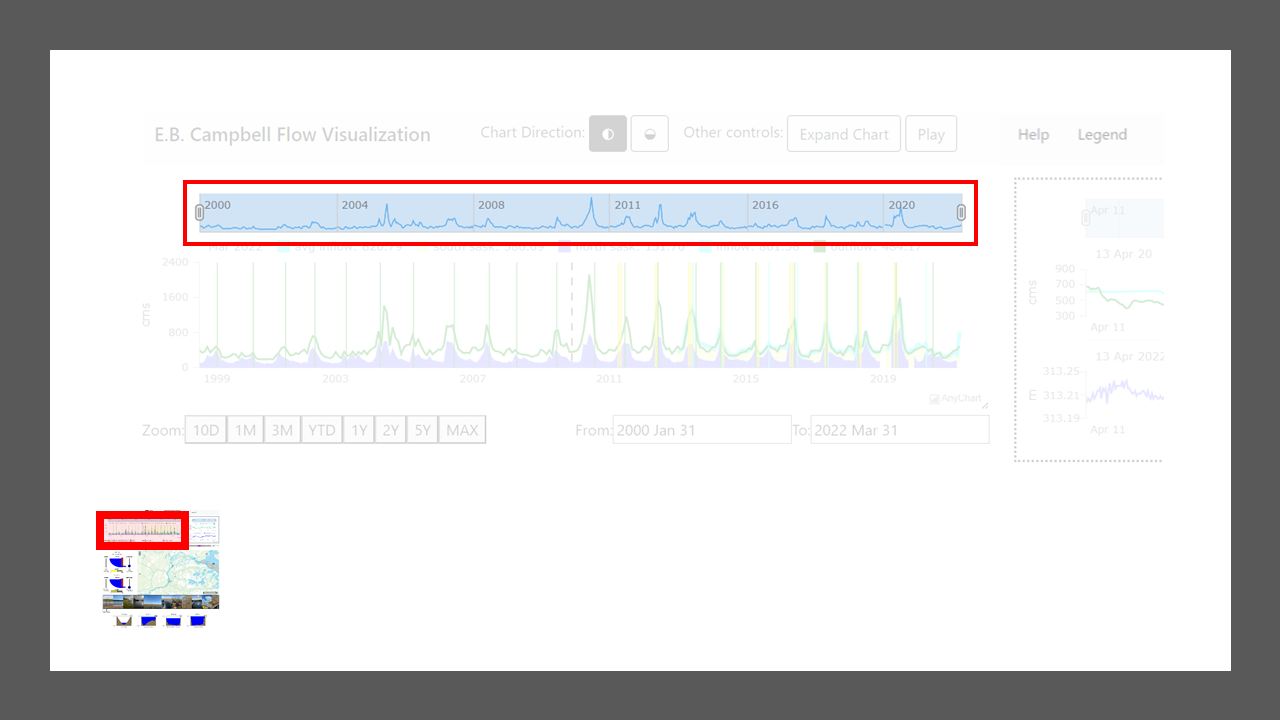
The selected area in the timeline above the chart can be adjusted by dragging the handles on each side or by clicking and dragging anywhere in the selected area. The selected area cannot be dragged until the time range in view has been shortened from the initial setting in which the entire range is selected.
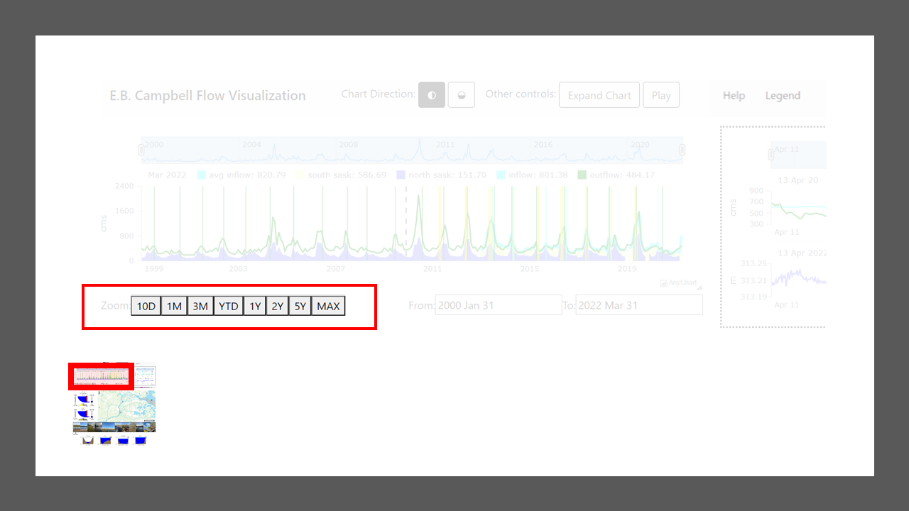
The time picker automatically displays the selected time range preceding the most recent data point. For example, if you were to select 1Y, the chart would display the most recent year of data. Within the selection options D stands for Days, M stands for Months, and Y stands for Years.
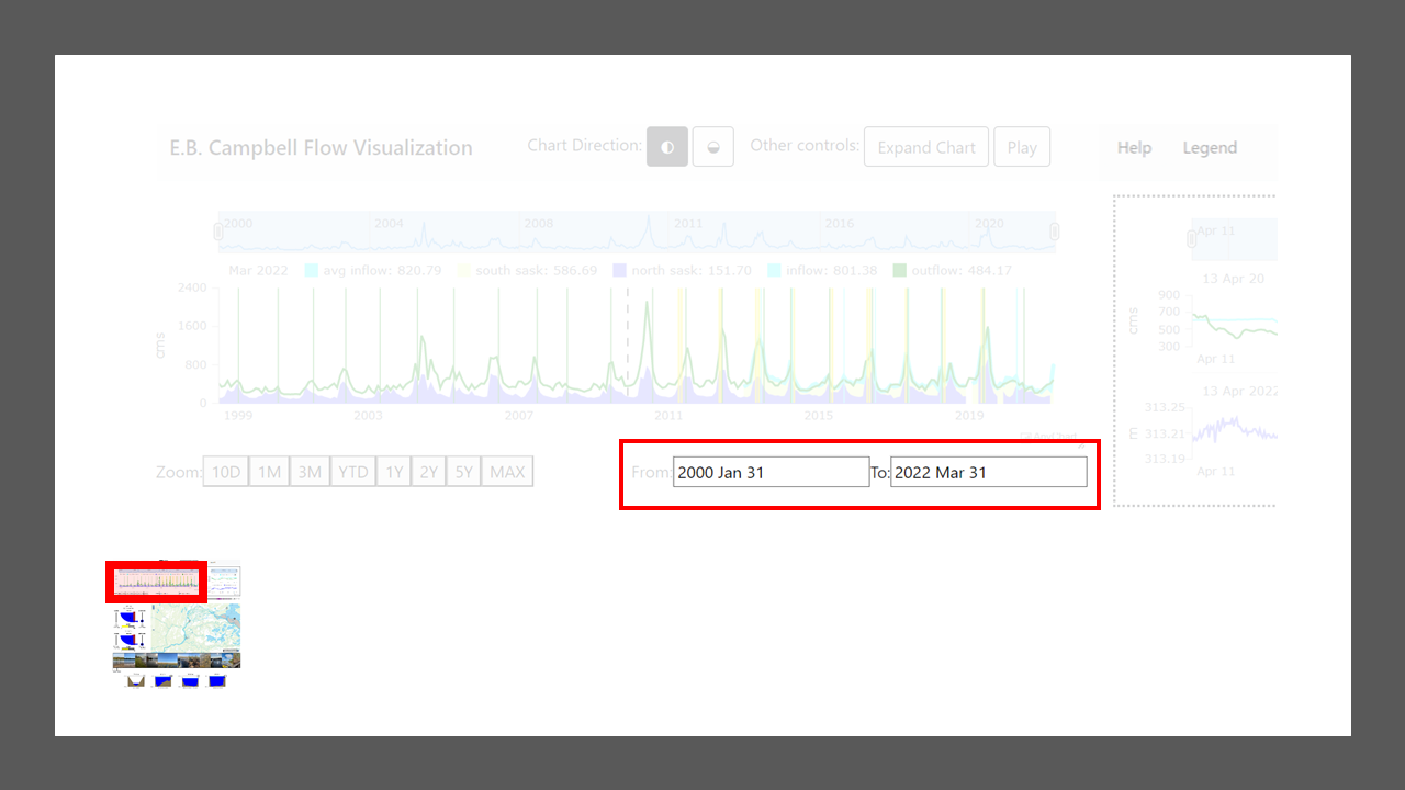
The date selector shows the time range currently displayed and can be adjusted to jump to a new range. After typing in new start date, end date, or both, hit enter to view the new selection. Depending on how much time is being displayed, the date in either endpoint may jump to the nearest data point. For example, it may jump to the nearest 1st of a month when viewing several years of data.
Lastly, if you click anywhere on the chart, the time frame displayed will jump to centre on the date you clicked on. Additionally, one can pan across time by clicking and dragging to the left or right directly on the chart.
Changing the amount of time displayed in the chart will display different resolutions of data. At lower resolutions you will observe data smoothed into daily averages. At higher resolutions, fluctuations in flow rates per day can be observed.
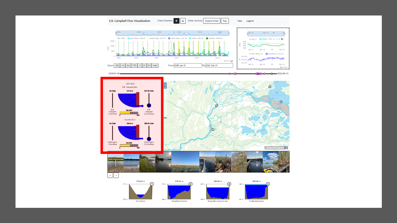
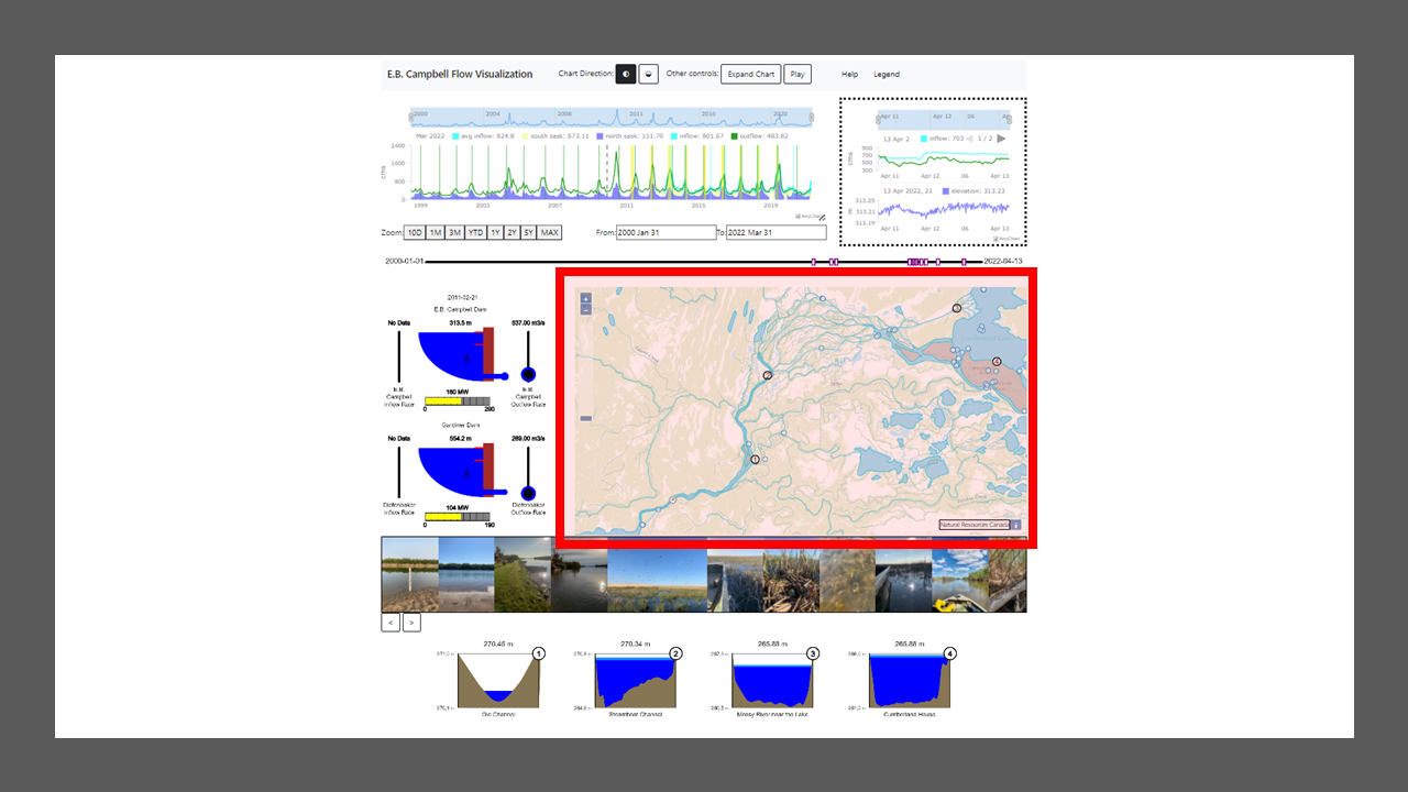
The data from the date at the centre of the historical chart will be represented in the dam view to the left of the map:
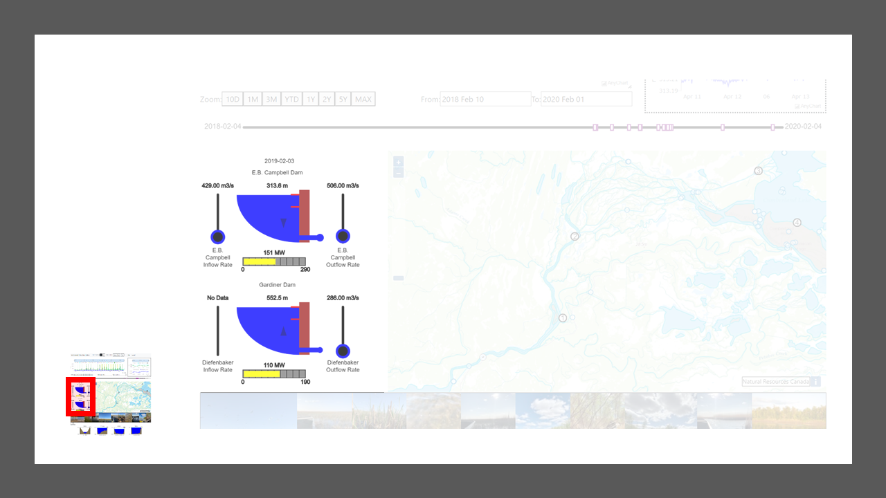
Data for E.B. Campbell is represented by the top representation and Gardiner Dam by the bottom one. To the left of each representation is a slider showing inflow, and the slider to the right shows outflow. Values for each of these are in cubic metres per second (cms).
In the centre of each diagram the elevation of the dam can be viewed. This value is displayed in metres. The blue section of the diagram shows how this elevation compares to the Minimum Supply Level (MSL) and Maximum Supply Level (MSL) represented by the red lines on the right side of each dam display. Lastly, the outflow rate is included in a calculation to display the amount of electricity in MW. This is displayed by the bar below each dam display. The bar shows the amount of electricity that can be generated by each station and the yellow shows how much of that capacity is being utilized.
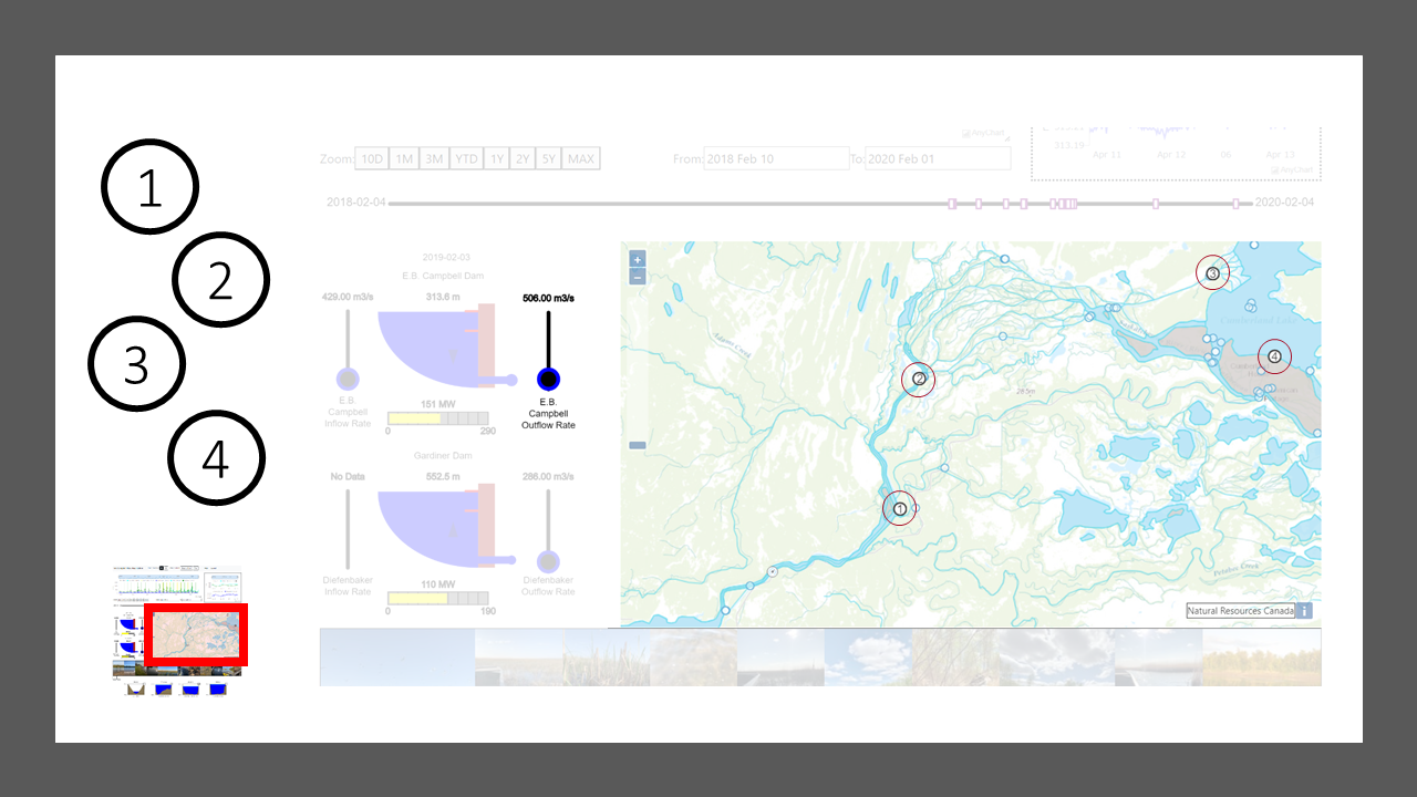
The outflow value from the E.B. Campbell display also feeds into several cross section displays at various points in the Saskatchewan River Delta. Each of these cross sections is represented by a number from 1 to 4.
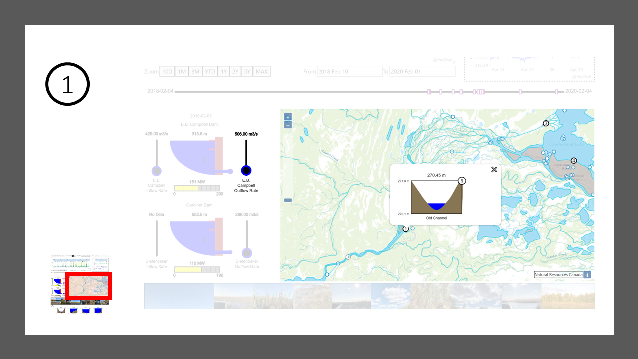
Clicking on one of these numbered markers brings up a pop up displaying the cross section. Dragging the outflow slider for the E.B. Campbell dam display will cause the water level in the cross section to rise or fall according to a linear formula that translates outflow to water level at these locations. This formula is based on water level samples taken in 2020 and is therefore a simplified representation of water levels in the delta in a wet year.
The popup can be closed by selecting the X in the top-right corner of the popup.
Conditions in the delta can be explored by photo record within the map feature:
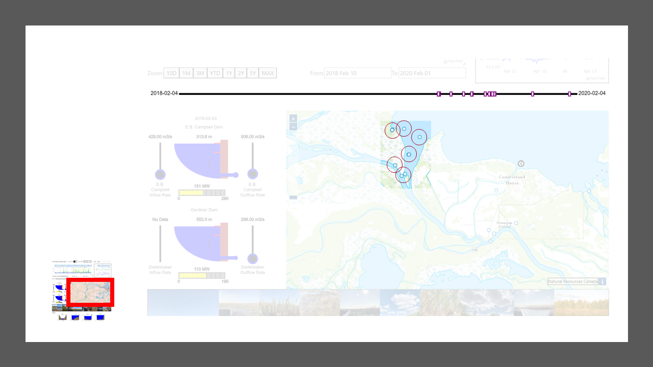
The time range displayed in the historical chart filters image markers on the map. The timeline above the map shows the distribution of these photos over the time frame being viewed. Hovering over the purple photo markers on the timeline will highlight the corresponding photo markers on the map. Clicking on one of the purple photo markers on the timeline will isolate the corresponding marker on the map. This can be undone by moving the mouse over the timeline.
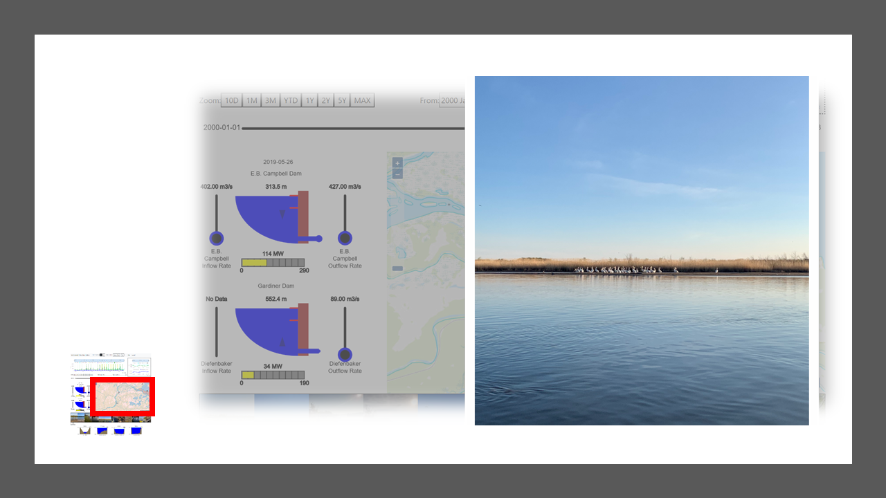
Clicking on a photo marker on the map will bring up the photo and set the dam display to the average conditions on the day of the photo. The photo can be closed by clicking an X in the top-right corner of the screen. The dam display will maintain the condition from that day until another photo is selected or the historical timeline is changed.

